Seaborn Heatmap – 综合指南
上次更新时间 : 2020 年 11 月 12 日
热图被定义为数据的图形表示,使用颜色来可视化矩阵的值。在这种情况下,为了表示更常见的值或更高的活动,通常使用较亮的颜色,而为了表示不太常见的活动值,首选较暗的颜色。热度地图也由着色矩阵的名称定义。Seaborn 中的热图可以使用 seaborn.heatmap() 函数绘制。
seaborn.heatmap()
语法: seaborn.heatmap(data, *, vmin=None, vmax=None, cmap=None, center=None, annot_kws=None, linewidths=0, linecolor='white', cbar=True, **kwargs)
重要参数:
- data:可以强制转换为 ndarray 的 2D 数据集。
- vmin, vmax:锚定颜色图的值,否则它们将从数据和其他关键字参数中推断出来。
- CMAP:从数据值到色彩空间的映射。
- 中心: 绘制发散数据时颜色图居中的值。
- 注意: 如果为 True,则在每个单元格中写入数据值。
- FMT 的: 添加注释时使用的字符串格式代码。
- linewidths: 线宽:将划分每个单元格的线的宽度。
- linecolor 中: 将划分每个单元格的线条的颜色。
- cbar 中: 是否绘制颜色条。
除 data 之外的所有参数都是可选的。
返回: matplotlib.axes._subplots 类型的对象。轴子图
让我们通过示例了解热图。
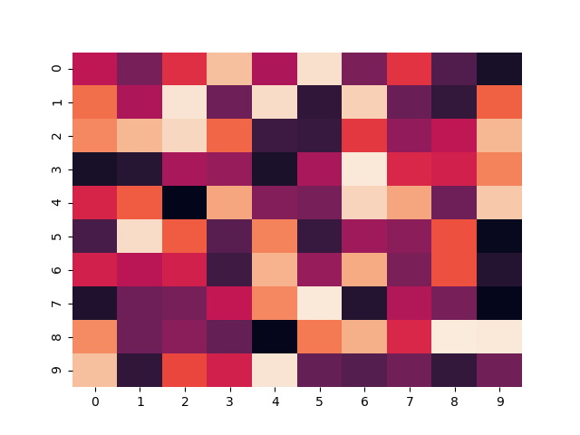
基本热图
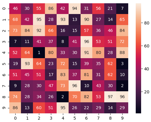
使用默认参数制作热图。我们将使用 NumPy 模块的 randint() 函数创建一个 10×10 二维数据。
import
numpy as np
import
seaborn as sn
import
matplotlib.pyplot as plt
data
=
np.random.randint(low
=
1
,
high
=
100
,
size
=
(
10
,
10
))
print
(
"The data to be plotted:\n"
)
print
(data)
hm
=
sn.heatmap(data
=
data)
plt.show()
|
输出:
The data to be plotted:

[[46 30 55 86 42 94 31 56 21  7]
[68 42 95 28 93 13 90 27 14 65]
[73 84 92 66 16 15 57 36 46 84]
[ 7 11 41 37  8 41 96 53 51 72]
[52 64  1 80 33 30 91 80 28 88]
[19 93 64 23 72 15 39 35 62  3]
[51 45 51 17 83 37 81 31 62 10]
[ 9 28 30 47 73 96 10 43 30  2]
[74 28 34 26  2 70 82 53 97 96]
[86 13 60 51 95 26 22 29 14 29]]
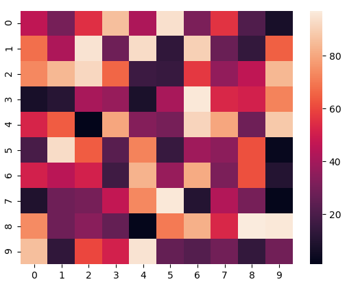
我们将在所有示例中使用相同的数据。
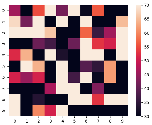
锚定颜色图
如果我们将 vmin 值设置为 30 并将 vmax 值设置为 70,则只会显示值介于 30 和 70 之间的单元格。这称为锚定颜色图。
import
numpy as np
import
seaborn as sn
import
matplotlib.pyplot as plt
data
=
np.random.randint(low
=
1
,
high
=
100
,
size
=
(
10
,
10
))
vmin
=
30
vmax
=
70
hm
=
sn.heatmap(data
=
data,
vmin
=
vmin,
vmax
=
vmax)
plt.show()
|
输出:
选择颜色图
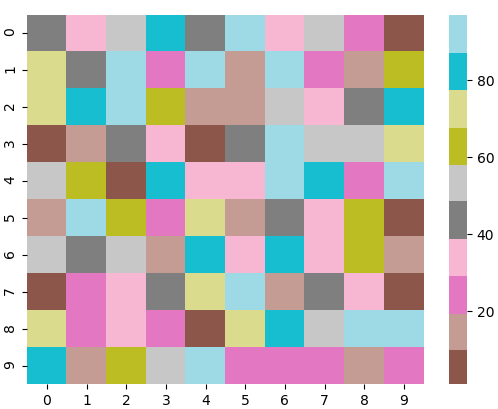
在这里,我们将查看 cmap 参数。Matplotlib 为我们提供了多个颜色图,您可以在此处查看所有颜色图。在我们的示例中,我们将使用 tab20。
import
numpy as np
import
seaborn as sn
import
matplotlib.pyplot as plt
data
=
np.random.randint(low
=
1
,
high
=
100
,
size
=
(
10
,
10
))
cmap
=
"tab20"
hm
=
sn.heatmap(data
=
data,
cmap
=
cmap)
plt.show()
|
输出:

将颜色图居中
通过将 center 参数传递为 0,将 cmap 居中为 0。
import
numpy as np
import
seaborn as sn
import
matplotlib.pyplot as plt
data
=
np.random.randint(low
=
1
,
high
=
100
,
size
=
(
10
,
10
))
cmap
=
"tab20"
center
=
0
hm
=
sn.heatmap(data
=
data,
cmap
=
cmap,
center
=
center)
plt.show()
|
输出:
显示单元格值
如果我们想要显示单元格的值,那么我们将参数 annot 作为 True 传递。fmt 用于选择所显示单元格内容的数据类型。
import
numpy as np
import
seaborn as sn
import
matplotlib.pyplot as plt
data
=
np.random.randint(low
=
1
,
high
=
100
,
size
=
(
10
,
10
))
annot
=
True
hm
=
sn.heatmap(data
=
data,
annot
=
annot)
plt.show()
|
输出:
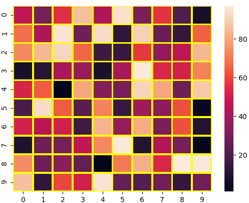
自定义分离线
我们可以分别使用 linewidth 和 linecolor 参数更改分隔单元格的线条的粗细和颜色。
import
numpy as np
import
seaborn as sn
import
matplotlib.pyplot as plt
data
=
np.random.randint(low
=
1
,
high
=
100
,
size
=
(
10
,
10
))
linewidths
=
2
linecolor
=
"yellow"
hm
=
sn.heatmap(data
=
data,
linewidths
=
linewidths,
linecolor
=
linecolor)
plt.show()
|
输出:
隐藏颜色条
我们可以通过将 cbar 参数设置为 False 来禁用颜色条。
import
numpy as np
import
seaborn as sn
import
matplotlib.pyplot as plt
data
=
np.random.randint(low
=
1
,
high
=
100
,
size
=
(
10
,
10
))
cbar
=
False
hm
=
sn.heatmap(data
=
data,
cbar
=
cbar)
plt.show()
|
输出:
删除标签
我们可以通过在 xticklabels 和 yticklabels 参数中分别传递 False 来禁用 x-label 和 y-label。
import
numpy as np
import
seaborn as sn
import
matplotlib.pyplot as plt
data
=
np.random.randint(low
=
1
,
high
=
100
,
size
=
(
10
,
10
))
xticklabels
=
False
yticklabels
=
False
hm
=
sn.heatmap(data
=
data,
xticklabels
=
xticklabels,
yticklabels
=
yticklabels)
plt.show()
|
输出:

 2024年11月10日 14:18


